Monday, October 24, 2022

Judging Photo Shows Pt. 4

 (If you're just joining, I am doing a series on judging photo shows. You can click the "Judging Photo Shows Series" label at the bottom of the post to see other posts in the series.)

Greetings!

Today's post is on color, condition, and workmanship. Nothing here is hard, just a nice easy post this time. :)

For color, we can refer to our breed standard (or our makeshift one). Remember that sometimes a color can happen in the breed that is not accepted in the registry. In this case, I like to see the shower make a tack-on to their reference stating that they are aware of the discrepancy. If this is not included, I may subtract a few points. It depends. In paint the color is really easy. Nobody in the class has a problem with their color abilities, so this factor does not change my ranking.

Next is condition. I don't want to see your carpet herd models. I'm looking for clean, well kept, not damaged horses. Rubs and scratches seriously knock you down the list, while a break essentially takes you right out of the running. None of the contenders have any notable problems with condition so this doesn't affect my ranking either.

⬆Carpet Herd Model⬆
VS
⬇Show Herd Model⬇

Lastly, you want to consider workmanship. Many (if not most) collectors consider workmanship as only applying to CM and AR. This is FALSE. Judges care just as much about the quality and intricacy of your OF. This means clean masking, great shading, nice roaning, etc. It also rests a lot on the degree of difficulty.
After considering the workmanship aspect, I switch around two sets of models. Sometimes there is nothing wrong with one model, but more things right with another. That is a terrible description of the degree of difficulty, but it is all I have in me today. You know what I mean, and if not, search Braymere's blog for degree of difficulty posts. :)

My final list is here. This is how I really placed the class in the end.

This is it, the last post of the series. Thank you for hanging with me! I'll be back to normal posts now. As always, if you have questions, go ahead and comment! Or shoot me an email.


In other news, CONGRATS to Equiden of equidensplasticponies.blogspot.com for 500 blog hits!!! Way to go! Here's wishing you 5 million more! 🥳

Friday, October 21, 2022

Judging Photo Shows Pt. 3

 (If you're just joining, I am doing a series on judging photo shows. You can click the "Judging Photo Shows Series" label at the bottom of the post to see other posts in the series.)


Hello all. Sorry for the unexpected hiatus. Life kind of went crazy last week, and I barely had time for anything. Everything should be mostly back on track now. :)

Now, back to the subject at hand!

Here is my first impression ranking, as promised.  

How did mine compare with yours? Don't forget this is just first impression, and has very little influence on the actual judging. Keep your sheet, because you will need it several times throughout the rest of the series.

Today's main topic is breed standard. For those not familiar, a breed standard is a statement of ideal conformation, color, temperament, and characteristics, issued by the official breed association or studbook (registry).

For this class, we are working with the Paint Horse breed. I will open a new tab beside my judging tab and load the APHA website. The APHA website is not helpful. The APHA website stinks. There is no official breed standard to be found. Thankfully, with a breed like Paint, you can usually find a reputable (preferably vet driven) website with a summarized statement of conformation and color. Mine came from PetMD.

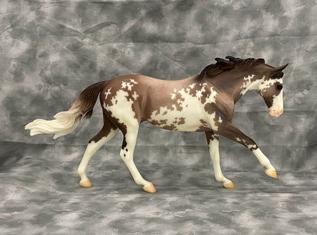
The American Paint Horse comes in various colors, amongst them, bay, chestnut, black, palomino, gray, buckskin, and blue roan. But, more important than their physical coloring, are their distinctive white markings. While the marks vary in size, the patterns are standard. The two predominant coat patterns of Paint Horses, the overo and tobiano, are distinguished by the position of the white coloring on the body.


The overo (Spanish, for “like an egg”) patterned horse has white spots extending across the back between the withers (the highest point on the back) and the tail. Typically, all four legs are dark-colored, but in order to be considered, at least one leg should be dark in color. Scattered and irregular white markings also appear all over the body. The tail should be solid in color, and the horse itself can be either primarily dark or primarily white. The overo pattern is generally used to describe most patterns that are not the tobiano pattern, which can lead to some confusion when describing a horse simply as overo. They include the frame overo, the sabino (speckled), and the splashed white overo. Many overo-patterned American Paint horses have blue eyes, especially the frame and the splashed white, and the tail is a single color.


The tobiano-patterned horse, on the other hand, has a solid-colored head with a white spot at front, which can be of various shapes (e.g., blaze, star, etc). The legs are white, with an appearance of white stockings. Apart from these distinctive markings, the spots on the rest of the horse’s body are in sharp contrast to the colored areas. These markings are commonly found on the neck as well as the chest. Spotting may be oval or round, and the amount of white varies as well. Some Tobianos have a large amount of white, while others have so little white that they appear not to be spotted at all. The tobiano usually has dark brown eyes and bicolored tail.


In addition, there is also the combination of the overo and tobiano, the third accepted coat pattern. Because of the risks that are inherent in some breeding programs, in particular, the lethal white foal condition that is related to the frame overos, combining breeds from different patterns will result in stronger bloodlines. This is important for the strength and survival of the Paint Horse, and also adds vitality to the splash markings of the Painted Horse. The resultant cross is referred to as a tovero.


The American Paint Horse has a muscular and firm neck, a muscular yet short back, strong legs, sloping shoulders, mid-size ears, and intelligent eyes.


So now that I have found a breed standard (or a rough translation of one), I can start grading the horses. If I was judging a live show class, or even a really big, formal photo show, I would write down notes on each model as I went. OMHPS is much more relaxed, and my show was more of a summer bash than a spring soiree, so I didn't take any notes. I just mentally jotted down each model's info in my head, and shuffled them around in order (using the OMHPS judging software).

Important to Note: I do not usually DQ a horse who does not fit the breed standard, unless it is a massive discrepancy (think an unreferenced palomino Arab, or a TB with heavy feathering). If they are just un-conformationally correct, then I will place them to the bottom of the class. After all, sometimes it is Breyer's fault that a model was born with a course head or ewe neck! Color is a bigger problem, but I usually will just not place a horse with wrong color. I do typically tack on a judge's note, mentioning the color issue, because some showers just plain don't know.


ACTIVITY:

That was a lot of information, so let's stop there and pull out our handy-dandy class placement templateReviewing the information given in the makeshift breed standard, and lightly referencing your first impression list, re-rank the models. You can find the photos of them in this post.

All done? If not, don't continue reading until you are. The rest of the post will sort of spoil the fun in doing this activity for you. It gives away the "answers".


After reviewing the standard, my list is at this stage.

Horse C was first on my 1st impression list as well. The photo is clean, the horse is clean, and the horse fits the breed standard well.

Horse E also fits the breed standard well. His back is slightly long, but that is where personal experience comes in. I am familiar with the Paint breed, and I know the average conformation fairly well. Not everyone looks like the ideal.

Horse A has excellent conformation, and is the same mold as Horse C.

Horse I is very well presented, and the conformation is neat and accurate. His legs are slightly long but once again, not everyone looks like the ideal.

Horse H is the same mold as Horse I, so obviously also has good conformation. I like the element of uniqueness in his color. Greys are not rare, just less common in models than bay or chestnut. He adds some nice variance to the class.


There is a lot of information in this post, so I am going to stop here. If you have any questions or comments, please post them in the comments!

Next post will be on workmanship, condition, and color impact. :) I promise that it won't be as delayed as this one. Thank you again for your patience.

Monday, October 17, 2022

Quick Update on the Series

 Hey there. I have not discontinued the series, I've just fallen behind. My life went a little crazy this weekend, and once I get all of that under control, then the series will resume. Hopefully by middle of the week. Sorry for the interruption.

Thank you for sticking with me!

SDS Wallace, Sardinian Donkey, Jack


Wednesday, October 12, 2022

Judging Photo Shows Pt. 2

(If you're just joining, I am doing a series on judging photo shows. You can click the "Judging Photo Shows Series" label at the bottom of the post to see other posts in the series.)

SDS Golden Zephyr, ASB, Palomino Stallion, who will be my example today for photo anatomy.

Hello all! Today we will tackle first impressions (good and bad) and photo anatomy.

First impressions really matter. When I look at a photo, I instantaneously form an opinion. It's the owner's job to make sure that opinion is a good one. Below is a list of somethings that I look for when forming my opinion, in roughly the right order.

  1. Do I see and DQ factors? Show DQ factors vary, but in my shows there's a strict no tack rule. I will immediately DQ any horses with tack. I don't want to waste my time judging a horse who can't win anyway.
  2. Is the horse accurate for the breed? It shouldn't be an OBVIOUSLY wrong color or be a MFT doing a Mangalarga Marchador's gait. I'm not too worried about conformation rn, but the biggies should be right.
  3. Is the image clear? The horse should be in focus - no grainy images either.
  4. Is the image well lit? I can't judge a horse I can't see. That means too bright lights too.
  5. What condition is the horse in? Rubs, scratches, and breaks do not make me happy.
  6. Is the horse properly angled? I don't want to see a horse looking head-on into the camera or at a 3/4 turn (although a 3/4 turn is the correct angle for some exceptional model's cases).
  7. Does the photo "read" nicely? This question deals mainly with photo anatomy, which is discussed in the next section below the list.
  8. Is the background messy? Is the color overwhelming? Does the horse get lost in it's backdrop? This sort of stuff rarely will affect the placement, but it can be a tie-breaker. Especially with metallic horses (like Akhal Tekes) that reflect the surrounding colors.
Moving on to photo anatomy. Photo anatomy sounds a lot fancier and harder than it is. Most people catch it right off when they are editing photos, but others struggle with it. Model horse photo anatomy is a little different than standard photography, so it can be a challenging transition for some people.
When you take your halter/breed show photo, you want it focusing level on a point between the horse's shoulder and barrel (usually on the shoulder), a little higher than halfway up. The focus point is where your eyes should land first when looking at the image.
Let's use SDS Golden Zephyr (AKA Zephyr) for our example.

(Keep in mind that there would be no watermark [or purple dot!] in a real photo show)

The purple dot marks the focal point of the image (roughly). From the dot, your eyes make a quick trip up the neck, onto the head, and down the mane. From there, your gaze runs along the back and down the tail. Then your eyes sweep across the legs, before slowing down to focus on stand-alone elements, like the eyeball, the hair ribbon, the dapples, etc. The exact path will vary for every horse. The path described would work for any Hamilton model, but it may not work with other molds.
This whole action should move very gracefully. You shouldn't have to start and stop and realign to "read" a photo. Everything should lead smoothly to something else.

Photo anatomy also deals with backgrounds. Here I will only discuss non-realistic backdrops, as realistic ones are a topic in and of themselves. When you are presenting your horse, think a lot about the background. Too many people think that the horse is all that matters. In a way they are right, but, when your background starts distracting from the the horse, or worse, eating the horse, it's time to switch it out. One backdrop usually doesn't fit all (there are exceptions). A backdrop eats the horse when it makes the horse blend in and play chameleon (that means socks too!!).

Please keep in mind that there is a lot more to photo anatomy, but this is just an overview.


ACTIVITY:

The best way to learn is to practice. I'm going to ask you to take a piece of paper and number it 1-5. Then I want you to write "DNP" below that. Leave a fairly large space beneath this label. Then jot down "DQ". You can also view/print a digital template here.
Now that you have your "template", review the photos of the entries here. Choose your placements based on JUST THE FIRST IMPRESSION LIST. Do NOT think about conformation, breed standard, or anything else. JUST THE FIRST IMPRESSION. You will do a few more lists like this in the next posts, and at the end you will compare your placements.
Don't lose your list! You will benefit from comparing them at the end. Oh, and FYI, you will not use all the slots on the template. I gave 4 DNP slots and 4 DQ slots so you could have free rein over where you place horses.


Thank you for reading! The next post is coming soon, and it will be on breed standard. I will be working directly with the horses in the class. I will also show my list on how I ranked the horse based on first impression. :)

Sunday, October 9, 2022

Judging Photo Shows Pt 1.

This is the first post in a series I am doing on judging. All the posts carry the same label, so you can see the other posts by clicking "Judging Photo Shows Series" down at the bottom of the post, near the publish date and comment launch. The other posts will accumulate there as I publish them. Expect the next post in 2-3 days. :)

Hello! Welcome to the series. I'm not going to waste time on introductions, because you already know what you're reading (if not, read the above bold blurb). I'm excited to take you on this discovery series, so let's get started.


Here is your basic overview of the class (this is what you would see before you open the class to begin judging):

  • Platform: OMHPS
  • Show: 2022 Spotted Dreams Photo Show
  • Division: OF Trad Breyer
  • Section: Stock
  • Class: Paint Geldings*
  • Class Size: 9 entries
*Don't look up the class to peer at the results! It will ruin the series for you. ;)

My initial impression is that this is a pretty easy class: normal breed, small size, easy scale, standard finish, etc.

With the exception of the appaloosa and Gypsy Vanner classes, I never open a class before I judge it. I really want to avoid any possibility of forming a bias. I only look at appys and Vanners because they are my weaknesses. 😛 For any other breed, the moment I open the class to judge is the first time I see them. This first impression is very important, and later I will discuss what makes it a good one.

Below is a series of photos of all the horses in the Paint Gelding class. They are listed in no particular order. Take your time, and just scroll down, getting a feel for what this class holds. Don't be critical (yet). This step is just an overview. Appreciate the good points, but don't even bother making a mental note of the bad ones. Excuse the watermark on the first image, it wouldn't show up in judging software, but it appears when I use the photo off of the website.
(These photos do not belong to me, and are the ones that the owners used on OMHPS. Most are at "original size" but a few were too big and had to be set at size "large".)
False names are used so that you are able to participate in the upcoming activity (next post).

Horse A

Horse B


Horse C

Horse D

Horse E

Horse F

Horse G

Horse H

Horse I

You'll notice that I did not credit any real names. I did that on purpose. If I listed names, y'all would be tempted to snoop around and find out what I placed them as. I don't want you doing that, as it will spoil the series for you. Please refrain from peeking until the end. Then I will give links to all the profiles, and the proper credit to the owners.  :)

That is all for the first post. Obviously I didn't get into the meat of the series, but I felt adding more would make the post too lengthy, especially considering the volume of photos. There will be another post soon, and it will be on what makes a good first impression, photo quality, and overall anatomy of a photo.

Thanks for reading!

Thursday, October 6, 2022

New Blog Series Coming Soon!


This has been in the works for awhile now. Starting hopefully in the next 2-3 days here, I will be doing a blog series on judging Photo Show classes. I will be dissecting a real Photo Show class from the show I hosted this past summer. The examples will be slightly tailored to OMHPS platform use, but the basic principles can be easily applied to any other sort of photo judging.
The example class will be a small one consisting of 5-10 horses. I would do a larger one, but I prefer to discuss fewer horses more thoroughly than more horses rather sloppily.

During this series,  I highly encourage you to post comments! If you have a question, about something I missed covering, or maybe about something I did cover and you didn't quite fully understand then please ask it in the comments! I promise I don't bite. :) I may answer it directly in the comment section, or I may tackle it in the next post. I'm hoping to space the posts out about 1 post per 2-3 days. It should be a no more than 7 post series, probably closer to 5.

Final Disclaimer: I am not the only person in the world, so that means that my opinion is not going to be the same as everyone else's. My method of judging is not identical to every other judge. Some people may not agree with certain points I make, and that's okay. Judging is a style. If we all had the same style, we would have no need for shows, because we would already know which horse was the best. Please, if you see something you don't agree with, don't be nasty. Post it in the comments if you want, and I will give you my reasoning, but please be respectful.


Saturday, October 1, 2022

Why Is My Studio Name "Spotted Dreams"?

I get asked this a lot. The answer is pretty simple, so I decided to share it on here. :)

The "Spotted" part: My favorite horse breed is the appaloosa, and my favorite horse color is appaloosa. My favorite customs to paint are appaloosas. My favorite models to collect are appaloosas. Notice a pattern? Lol, bad pun. So yes, I chose Spotted because it fit so well with everything that I do.

The "Dreams" part: I firmly believe that every model horse is a dream waiting to be discovered. A model horse in the hands of a child is a permission slip to let themselves be carried away on the winds of hope. If a carpet herd model could talk, imagine what they would say. Imagine all the races they ran, the cows they wrangled, the tumbleweeds they chased, the stories they heard, and the tears they dried. All the dreams they nurtured. If I can help a model be the reason someone spreads their dreams and flies, then I will be happy.

I mainly use studio at the end because I started using Spotted Dreams as the name I sold customs under. It just stuck. I have used stables in the past, but studio seems to fit better. I use "SDS" at the beginning of all my horse's names to keep them separate from other models who may have the same name. Especially with common names like "SDS Be My Valentine" for the Valentine release on Giselle.

There you go! Now you know. :)

Two versions of my logo are below.

This is my main one.

I have this one as an alternate should a white background not work with something.